
Use WinterCMS Macros to create simple re-usable components
When you start learning Winter's theme-building, you rush out the bases: layouts, pages, partials, content and the routing.
Then the documentation talks about macros but even its name is a mistery.
You read the documentation because it's the only page that you didn't read yet into the Themes section but you don't feel the need for this feature at the moment so just forget about them and build awesome themes without their powers.
Remember that moment? It was a huge error! The macros has been for a while the missing piece to my knowledge to speed-up my themes creation. If you need proves, you can see the result of this tutorial at the end of this page.
Twig Macros is detailed into the Winter's documentation as a feature which allows you to define custom functions in your templates, similar to regular programming languages.
A function into a template engine is used to render or format content.
Let's build a section of this awesome TailwindUI settings page.
To keep it simple, we will focus on this section:
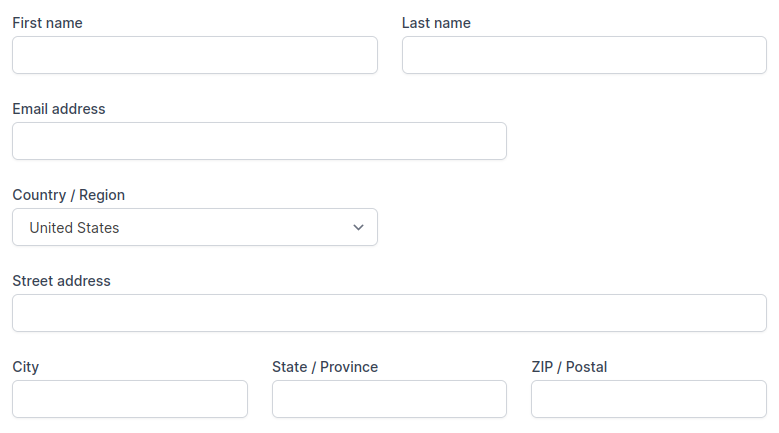
If you take a look at the TailwindUI code, this section would take 45 lines of code into our page, full of input and label repetition and if you want to reuse the fields appearance on another page, you'll need to copy/paste the code from one page to the other.
To avoid this, let's create our first macro!
Our first Twig macro
To create our first macro, we just need to create a file into the theme's partials directory, I generally create a folder into it named macros:
myTheme
|--- layouts
|--- pages
|--- partials
    |--- macros
        |--- form.htm
Now we pick the code for an input directly into the TailwindUI code and extract the parts that need to be dynamic:
<input
    id="[IdIsDynamic]"
    type="[TypeIsDynamic]"
    name="[NameIsDynamic]"
    autocomplete="[AutocompleteIsDynamic]"
    value="[ValueIsDynamic]"
    class="mt-1 focus:ring-indigo-500 focus:border-indigo-500 block w-full shadow-sm sm:text-sm border-gray-300 rounded-md"
/>
Making the type dynamic allow us to use it for name, email, password, zipcode and so on...
The more a macros is re-usable, the more you'll find them useful.
Basically all the thing that need to be static is the style so we only kept the class attribute from the original code.
Now the equivalent macro:
{% macro input(name, value, type, id, autocomplete) %}
<input
    id="{{ id|default(name) }}"
    type="{{ type|default('text') }}"
    name="{{ name }}"
    autocomplete="{{ autocomplete|default(name) }}"
    value="{{ value|e }}"
    class="mt-1 focus:ring-indigo-500 focus:border-indigo-500 block w-full shadow-sm sm:text-sm border-gray-300 rounded-md"
/>
{% endmacro %}
We used the default Twig filter to makes some parameters optional. The e filter is needed to escape HTML into user's input to avoid XSS attacks.
Notice that as said in the documentation: all the macro's parameter are optionals,
you'll need to keep that in mind and not use this input without at least a name to be usable. No error will be thrown.
This input macro could now be used to render an input field of type text, password, you can style it as you want and then use and it as many time you need an input into the site.
To render it, we first need to import the macro inside our page, layout or partial we want to use it:
{% import 'macros/form' as form %}

{{ form.input('first_name') }} {# This will render our input[type=text] #}
You can use logical structures into macros
Now let's build the Country / Region dropdown, to render the options, we'll need to loop into all the key/value pair provided to the macro.
You can use all the basic structures supported by Twig, conditions and loop as an example but the list is not exhaustive.
We decompose the original code for the dropdown:
<select
    id="[IdIsDynamic]"
    name="[NameIsDynamic]"
    autocomplete="[AutocompleteIsDynamic]"
    class="mt-1 block w-full py-2 px-3 border border-gray-300 bg-white rounded-md shadow-sm focus:outline-none focus:ring-indigo-500 focus:border-indigo-500 sm:text-sm"
>
    <!-- [NeedALoopHere] -->
    <option value="[ValueIsDynamic]">[KeyIsDynamic]</option>
    <!-- [EndOfLoop] -->
</select>
So here is the corresponding re-usable macro:
{% macro select(name, options, value, id, autocomplete) %}
<select
    id="{{ id|default(name) }}"
    name="{{ name }}"
    autocomplete="{{ autocomplete|default(name) }}"
    class="mt-1 block w-full py-2 px-3 border border-gray-300 bg-white rounded-md shadow-sm focus:outline-none focus:ring-indigo-500 focus:border-indigo-500 sm:text-sm"
>
    {% for optionValue, label in options %}
    <option
        value="{{ optionValue }}"
        {{ optionValue == value ? 'selected="selected"' }}
    >{{ label }}</option>
    {% endfor %}
</select>
{% endmacro %}
To pass our options to the macro, we only need to pass them with an array or object syntax:
{% import 'macros/form' as form %}

{{ form.select('country', {us: 'USA', fr: 'France', uk: 'United Kingdom'}) }}
For some case, it's easier to use array syntax to pass the options, keys (and so the value passed when submitting the form) will be 0, 1, 2 and so on.
For the long list of options, we could have used a variable filled with an associative array from the backend and just passed it to the macro.
One level higher: Nested macros
We reduced the amount of code needed to render our settings page by a lot but we can go further by creating a nested macro to build all our form group including the label.
First let's build our basic label macro:
{% macro label(name, id) %}
<label for="{{ id }}" class="block text-sm font-medium text-gray-700">{{ name }}</label>
{% endmacro %}
Then, to use a macro inside another of the same file, we need to import it directly into the {% macro %} tag, using the _self keyword.
{% macro group(name, value, type, id, autocomplete) %}
    {% import _self as form %}

    {# Now we can use form.input, form.select and form.label #}
{% endmacro %}
Because our input group needs to handle both input and select, we will use a conditional structure into it:
{% macro group(label, name, value, type, id, options, autocomplete) %}
    {% import _self as form %}

    {# Beacuse we made the id into label "required", #}
    {# we handle its eventual fallback to name as soon as possible #}
    {% set id = id|default(name) %}

    {# Render the label #}
    {{ form.label(label, id) }}

    {# Render the input, depending on the type #}
    {% if type == 'select' %}
        {{ form.select(name, options, value, id) }}
    {% else %}
        {{ form.input(name, value, type, id, autocomplete) }}
    {% endif %}

{% endmacro %}
We could have handled any type of input such as
textarea,checkbox,radioand so on, that's up to you to get deeper!
Now let see our final result to render the exact TailwindUI original code:
{% import 'macros/form' as form %}

<div class="grid grid-cols-6 gap-6">
  <div class="col-span-6 sm:col-span-3">
    {{ form.group('First name', 'first_name') }}
  </div>

  <div class="col-span-6 sm:col-span-3">
    {{ form.group('Last name', 'last_name') }}
  </div>

  <div class="col-span-6 sm:col-span-4">
    {{ form.group('Email address', 'email', null, 'email') }}
  </div>

  <div class="col-span-6 sm:col-span-3">
    {{ form.group('Country / Region', 'country', null, 'select', 'country', ['United States', 'Canada', 'Mexico']) }}
  </div>

  <div class="col-span-6">
    {{ form.group('Street address', 'street_address') }}
  </div>

  <div class="col-span-6 sm:col-span-6 lg:col-span-2">
    {{ form.group('City', 'city') }}
  </div>

  <div class="col-span-6 sm:col-span-3 lg:col-span-2">
    {{ form.group('State / Province', 'state') }}
  </div>

  <div class="col-span-6 sm:col-span-3 lg:col-span-2">
    {{ form.group('ZIP / Postal', 'postal_code') }}
  </div>
</div>
Now it's done, dry as possible! We created our first basics components, using Twig macro feature!
We've built them to be re-usable:
- For some complex case like a wysiwyg editor, you can individually render a
label - For basic usage, you can directly use a `group
- The same way we've created the
selectandinput, it's now up to you to create thetextarea,checkboxandradioto be complete.
Bonus! Error handling through data-validate-for
Out of this tutorial, and because you are now able to do it alone.
Here is a trick I use any-time I build a website to handle form's validation with the data-validate-for AJAX extra-feature
{% macro errorString(name) %}
    <div data-validate-for="{{ name }}" class="text-red-500 error-message"></div>
{% endmacro %}
Of course, this can be used directly into our group macro!
{% macro group(label, name, value, type, id, options, autocomplete) %}
    {% import _self as form %}

    {% set id = id|default(name) %}

    {{ form.label(label, id) }}

    {# This will display error if there is one #}
    {{ form.errorString(name) }}

    {% if type == 'select' %}
        {{ form.select(name, options, value, id) }}
    {% else %}
        {{ form.input(name, value, type, id, autocomplete) }}
    {% endif %}

{% endmacro %}
To use this feature, you need to include the
{% framework extras %}tag to your layout and make sure to usedata-request-validateon your form tag.
Now that you know how to build it, I invite you to see this awesome comments form below which has been built using these features and use it!
Comments
Be the first to post a comment!